Thursday, December 6, 2012

Its the end of the semester!

So its the end of the semester and its time for an update.

This is the finished game board I created for Illustration.


Here is my illustration final. Our objective was to create an illustrative narrative of a story. I chose to illustrate the Princess and the Pea.


The next two pieces are from my printmaking class. The first piece is my first time using aquatint and I chinc crolleed a newspaper collage onto the background.


This next piece is my final. This installation included multi-layered pieces. Since the whole theme was inspired by marie antoinette and the rococo period, it seemed appropriate to make use of some rhinestones. I even went as far as to scent it with Couture Couture by Juicy Couture.


Wednesday, October 31, 2012

NightLife Game Board

Here's one of my projects i'm working on. It's my version of the game of life. The game takes place in a downtown area and I wanted the colors to reflect a night time mood... I also want all the buildings to be 3D.
The hardest part of creating 3D pieces is all the math that goes into it. I had to think all the way back to trigonometry in high school. Even though my brain is fried from this experience, it's worth knowing that everything will fit together correctly the first time.
After the math was all done, I went back and drafted up the final versions of the buildings.
After about 8 hours of coloring, I finally was able to print.
So far, i've spent like 20 hours total on this project. Even though the long nights of endless cups of coffee seemed painful, in the end it was all worth it. I'll post up final pics of this project as soon as i'm done with it. This illustration class has inspired me in all new ways. Before, I used to create all of my imagery using vectors and gradients. I think the most valuable thing that i've learned this semester was how to "paint" in photoshop on multiple layers. I always felt like my work was lacking something. But now that I'm taking both printmaking as well as this illustration class, I'm learning how to incorporate more organic elements into my work.

Wednesday, June 20, 2012

KM DELIVERY BRANDING

I've been working on branding a small family owned shipping business for the past two weeks. Here is the logo starting to form.

These are the sketches.


I settled on a typographic logo that gives the illusion of a shipping box. the "K" is highlighted by an accent color. The "K" also hints at an arrow. So this logo literally says KM delivery moves your stuff.


This logo below is probably going to end up being the final one.


Up next is stationery.

Wednesday, April 25, 2012

Magazine Binding Process!

I decided to print, bind, and cut all of my own magazines and they are so GORGEOUS. I'm not tooting my own horn here but the bloomberg magazine is amazing actually printed out. The table of contents is more than what I hoped for.


Monday, April 23, 2012

WEBSITE IS UP!!!

My website is up and running!!!

http://www.michaelmanisa.com/

Sunday, April 22, 2012

Website Progress

After a week-long headache with the wordpress format, I'm very excited to announce that my website is near completion. This is my first website that I have built from scratch. I was really scared to tackle such a project knowing that I only had two days to do so, but I had no choice. I scraped the wordpress format and just decided to code a website from scratch. It was actually really fun and I really do hope to learn more advanced things in web development in the near future. I just loved the entire process of creating a website from scratch. The feeling that the WHOLE THING was the result of your own hard work.

The problem that I had with my original idea of a horizontal scrolling gallery was that it would not work well on my phone. The gallery function required that the user use the scroll bar or hover over a corner of the screen to get it to scroll. The problem is that you cant hover over a point or scrub a scroll bar very well on a touch screen device. I chose to go with this simple layout because I know that it will work on mobile devices.
Because of the time constraints on this website, it is very minimal and clean. In the near future, I would like to play around with some animations and transitions in HTML 5. Possibly add a moving background? I know that I only have 9 featured projects at this point, but after I create enough work to be website worthy, I will add another page that has way more pieces in it and divide it out into categories. But for now, it's time to get ready for that review. =)

Thursday, April 19, 2012

Self Stationery Progress

One step closer to finishing my stationery.


Monday, April 16, 2012

Personal Branding!

These Are Just screen Shots


Thursday, April 12, 2012

Ipad App Design

I chose to create an app to help people navigate the complex world of table etiquette. In a way, this app is like a cheat sheet. Here you will learn how to properly set a table and distinguish the difference between a salad fork and a fish fork. In the end, there's also a short tips section that states all the general rules to follow in order to avoid committing an etiquette faux pas.

Home Screen


Menu Screen


Table Setting Test


On the Ipad

Wednesday, January 11, 2012

MUSIC VIDEO PROJECT

THE SONG I CHOSE


VIDEOS I LIKE

FLORENCE AND THE MACHINE - COSMIC LOVE


RUSS CHIMES - TARGA


I AM 95% sure of my choice =)

Monday, December 5, 2011

Monday, November 21, 2011

Just an Update.

So Im finally starting to learn Cinema 4D and it is seriously SO much fun. I already posted about this on Facebook, but seriously. I haven't felt this excited about something since Chick Fil A came out with their spicy chicken sandwich. OMG OMG OMG. I'm Hrmm.. maybe I should create Cinema 4D renders of Chris's package designs? lol


So our next assignment in Stan's class is to make a motion peace about the 'It Gets Better' campaign or the anti-bullying campaign.. When I first heard about this assignment at the beginning of the year, I was really excited for it. The only problem is... it is really hard to conceptualize for something that I am emotionally invested in.


These are the packages for Chris's class.

Tuesday, September 6, 2011

9-11 Tribute Poster


The concept behind my poster is the basically the idea of a memory that constantly lingers in the back of your mind. The story starts with the plane ticket. Someone is about to take a trip to Los Angeles, but feels some kind of hesitation due to the memory of the events that occurred on 9-11-01. This person then starts to see things that aren't really there, hence the twin towers in the shadows.

I feel that this could be part of a bigger ad campaign. Instead of books, other posters could be other setting with different objects casting shadows of the twin towers upon surfaces.

Sunday, September 4, 2011

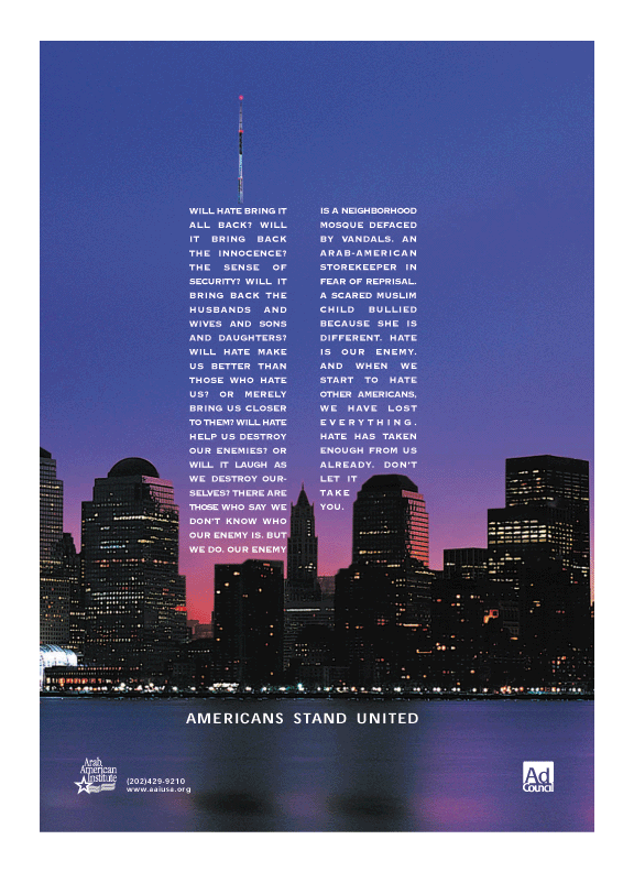
9-11 inspirational ad.


I found this ad while I was googling. lol. I love the message of this ad. It's 9-11 without the stereotypical red, white, and blue. This also goes along with Mario's idea of also displaying the pain that it also caused a lot of muslim americans.

Thursday, September 1, 2011

THE GOOD VS THE BAD

GOOD


This ad is just so cute. =)

BAD


I just don't understand the ad. What does pizza have anything to do with cigarettes?

Tuesday, May 24, 2011

JOHNNY CUPCAKES BRAND

A friend just told me about this clothing company called Johnny Cupcakes. I just love the brand. The logo is amazing and playful. The colors are bright and poppy. The most unique thing about this company is that when you buy a t shirt, they package it in a box that is similar to that of a cupcake box from a bakery. =) I just feel that I had to share this company's branding.

http://shop.johnnycupcakes.com/shop/

Tuesday, May 10, 2011

Saul Bass-like infographic

http://mashable.com/2011/05/09/sitting-down-infographic/

This infographic is very cool and informative. It says that sitting down for more than 8 hours a day increases our risk of death and obesity. So in the end, it's important for us to take frequent breaks.

Tuesday, May 3, 2011

RUSS CHIMES

MIDNIGHT CLUB EP

This is a mini film. I love how it tells the story without the use of words. I love the film editing so much. I literally got chills while watching this.


Sunday, April 24, 2011

Yulia Brodskaya

I was looking at different types of paper when I came across this... An artist named Yulia Brodskaya who creates these amazing pieces of art using paper... These images look like something that you would create using photoshop or illustrator, but no, she uses paper. They're so beautiful and inspiring. Look her up for more works. They're amazing!


Monday, April 18, 2011

Update: Late Night Alumni CD Box Set


The design for the CD package is FINALLY done... Approximately spent 4 hours. No food, or water... lol... but it's done!