Saturday, December 11, 2010
NEW PERSONAL LOGO
After Laura told me that my logo was too similar to a resort in mississippi and told me that I shouldn't take it out to the real world. I felt the need to redesign it. Here are some ideas for a new personal logo. I hope people will actually read this and leave comments on which one I should pick, or I should keep brainstorming...

Thursday, December 9, 2010
MY FIRST WEBSITE!!!
IS DONE!!!! =)
Ok, I finished my first website ever. I uploaded it and everything. I went ahead and linked everyone else's home pages to my navigation bar. There were specific instructions on Paige's email which dictated that the home page must be named index.html.. I REALLY do hope that everyone else follows through, because I really don't want to go and re enter urls in the morning.
This web assignment was actually really fun. I liked it a lot. I complained a lot at the beginning of the semester that it feels like I only use one side of my brain for this program and that I miss using the other one... I mean, INTENSELY using it. I feel that the coding portion of this assignment gave me just what I needed. I told Misty in class yesterday that I thought that the coding part of this assignment was actually more fun than the actual designing portion itself. She just looked at me funny.
But yeah, I'm so happy that I finished my LAST PROJECT OF THE SEMESTER! I'm actually satisfied with the way my website turned out. Especially since it's my first attempt at finishing an entire six page website. This experience has made me want to learn more, create more, and code more. I might actually redesign this blog over the winter break. =) (I know smilies are unprofessional, but hey, they're cute.)
Click Here for It.
Tuesday, December 7, 2010
OMG LOOK AT THAT PULL QUOTE!

The pull quote in yellow is very interesting. I just had one of those "WHY DIDN'T I THINK OF THAT?!" moments. =/
The image came from "11 Essential Tips for Good Print Typography".
Monday, December 6, 2010
Blog Assignment #11

I don't own any graphic Tee's worth mentioning here. When I buy clothes, I always go for items that are unique in construction and fabric. I always look for something with a unique shape, unique buttons or zippers, or the "grain" of the fabric is different, or how there may be a little strip of something shiny running through the fabric. I am a firm believer that the fabric has to make a statement for itself and that graphical elements are just something to accent the main design which is created by the fabric. This Tshirt that you see here is something of an exception. I like the fact that the graphical element on this t shirt is made of felt instead of ink.
Blog Assignment #14
I don't really collect anything, but I did collect coins. Ever since I was younger I always had this fascination with coins. I currently have an international coin collection of coins from europe, central america, mexico, the caribbean, parts of asia, and Canada. I hope that the collection will continue to grow, but as of recently, I haven't had the time, or money, to travel. I attempted to collect all 50 quarters of the states, but I quickly learned that collecting local coins is impossible due to the urge to spend it. I remember peeling the quarters off my quarter map because I needed gas money to get to school. UGH. =/ Maybe one day I can put back the quarters that I took off.
Blog Assignment #3
Design Trends
Trends I like:
White space - As time goes on, pages become less cluttered.
Typography - Designers are starting to make the text part of the overall design rather than something thrown on.
Sketches/Hand drawn illustrations - This gives the design a more unique and personal touch.
Large Images -
Overlapping Color - I'm starting to find a lot of overlapping color in logo designs. This technique makes it seem as if the elements are transparent.
Trends I don't like:
the use of Papyrus - This font is popping up everywhere. Has it slowed down?
Blog Assignment #4
Works of art that inspire me.
The Chicago Bean

Claire Morgan Sculptures


Santiago Calatrava Architecture


The Chicago Bean
Claire Morgan Sculptures
Santiago Calatrava Architecture
Blog Assignment #13
I like all of these album artworks because they all tell a story. They aren't glamor shots, or a random pic of the artist. These images provoke a feeling from the viewer and sets the mood for the album.
 |  |  |
 |  |  |
Blog Assignment #2
Here are some examples of good and bad design.

OLD= GOOD
NEW= BAD
Here are more examples of bad design.

You can also just go to this link .
Good Design is


Or you can just visit good magazine and look at some infographics.
OLD= GOOD
NEW= BAD
Here are more examples of bad design.
You can also just go to this link .
Good Design is
Or you can just visit good magazine and look at some infographics.
Blog Assignment ONE
I feel like these 5 pieces were responsible for my acceptance into the program.
Aveda Ads


Skittles Package Design

Lady Gaga Poster

Mailer

Stationery

I am happy with all of them. If I had to change something about them, it would probably be something minor, like using a different paper thickness on the mailer.
Aveda Ads


Skittles Package Design

Lady Gaga Poster

Mailer

Stationery

I am happy with all of them. If I had to change something about them, it would probably be something minor, like using a different paper thickness on the mailer.
Tuesday, November 23, 2010
Blog Assignment #8
Each week, I feel I must check in with...
HGTV. There's just something about this channel that I always HAVE to keep up with. I just love watching the "entire" design process from start to finish. I enjoy watching things go from the drawing board to the finished piece. I love watching how designers can create a feeling with what colors they choose to use in a space or how the arrangements of the same pieces in a space can make a a huge difference in how a person perceives the design as a whole. Design can influence the world a lot. It can determine how the public perceives a company. It can determine if a business is successful. It can also determine the productivity of individuals utilizing the space. Design is everywhere.
HGTV. There's just something about this channel that I always HAVE to keep up with. I just love watching the "entire" design process from start to finish. I enjoy watching things go from the drawing board to the finished piece. I love watching how designers can create a feeling with what colors they choose to use in a space or how the arrangements of the same pieces in a space can make a a huge difference in how a person perceives the design as a whole. Design can influence the world a lot. It can determine how the public perceives a company. It can determine if a business is successful. It can also determine the productivity of individuals utilizing the space. Design is everywhere.
Tuesday, October 26, 2010
My Thoughts on the New Belk Logo
I don't really like it. I was driving to work one day and noticed that the belk sign changed. I don't know how to take it in. I feel as if they are trying too hard to be bloomingdale's and macy's by adapting such a similar font. I feel that by doing this, in a way, they are following the crowd. Eh, who knows maybe it'll grow on me, just like the time when Honda redesigned the civic back in 2006. At first, I didn't really know how to react to it. Now, I LOVE it.
Thursday, October 21, 2010
Wine Box Design

Inspiration comes from looking through a mess of tangled vines at something. In this case, you are looking through "grape vines" at the vine bottle inside.
Sunday, October 17, 2010
CB2!
I love this new furniture store by Crate&Barrel. I went there over the weekend and literally had one of those moments. Some reason this store just inspired me.


Week Five Blog Assignment
Block of Type
I know that these entries are coming in a little late. lol. But after remembering that these things are required, I also realized that these are actually fun to do! =) So here are some pictures of my neighborhood. Well, the area that I always spend most of my time in anyway.
On my way to work I saw a poster of veggie type!

A free movie pass from focus features given to me a by work.

The bags at work we put our jeans in.

The mall food court. There is so much typography in this space. It amazing how many advertisements a person can get hit with in such a little space.

One of my favorite stores. I think its a good use of Helvetica.

At carribou coffee. Something about this makes me happy.

The caribbou coffee window appliqué. I think its a good mix of font faces.

Noon Café in midtown.


Thursday, October 14, 2010
Week Seven Blog Assignment
Books and Periodicals.
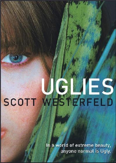
Recently, I read this book called Uglies. I rarely have the time to read non-fiction books, but I finally read this entire novel from start to finish in one day, mainly due to the fact that I was sitting through jury duty and I had nothing else to do. =) But I'm glad that I was forced to read that book that I've been itching to read since I bought it a year ago for it was a really good book.
The story is about a society obsessed with being perfect and how everyone goes through a forced cosmetic operation after their sixteenth birthday to become a pretty. Then they would move to the part of town where the pretties live and play. All they do all day is party and do things that pretty people do. I know this sounds stupid, but it take place in a futuristic society where kids get around town on hoverboards, everything that you can possibly need would pop out of the walls, and authorities keep track of you through an interface ring that you are forced to wear.
While I was reading the part of the story where the main character, Tally, describes what it is like to be in New Pretty Town, I couldn't help but to think about how they lived. What do their homes look like? What does their furniture look like? What kind of art are they into (if they are even into art)? What do their cocktail napkins look like? Or what kind of clothes do they wear?
The imagery that came to mind made me want to start designing things that look futuristic, clean, metallic, sleek, and beautiful. It made me want to create something that they would've used or found aesthetically appealing. Somehow, their society was also environmentally conscious, so whatever I designed, it not only had to be very sleek and modern, but organic at the same time.
Tuesday, October 12, 2010
Week Six Blog Assignment
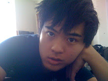
This is where I work 25% of the time. The city gives me something when I look out the window. Some may call it inspiration?

I got my friend to take my photo while I was 'working'. =D
*Addendum: This is NOT my place. lol. I realized that I forgot to mention this little fact. I was wondering why people kept thinking I live in the city. lol. I always crash here bc I do live in BFE. I do a lot of my work here. Plus, the city inspires me. =)
[Below]
As of recently, this is where I do my work 50% of the time. Normally I work on my desk, but currently it is cluttered with products and boxes bc I just moved. So as of right now, I work on my bed.

For the other 25% of the time, I work in my car or in class. My life is very busy so I try to get homework done anywhere I can.
Wine Bottle Proposal Brief Extended
THEME
When designing this bottle, I figured that I wanted to do something very dramatic. While looking up pictures of grapes, I realized that grape vines have a sense of drama to them. So I went with the idea to use stylized vines as the theme for the design. The bottle with be frosted white with a white transfer of a stylized vine wrapping around the bottle. Also I want to experiment with texture rather than color. The idea of a glossy design on a matte surface of the same color adds the sense of drama that I am looking for without making the design too complicated.
COLORS
My color scheme is going to be primarily black and white. There’s a simple elegance to black and white. I’ve sat at the computer screen for hours trying to pick out a color scheme that may be suitable for the look that I am going for but I always came back to black and white. In my opinion, it makes a whole lot of sense. The type of wine that I am redesigning is a white wine and it doesn’t really offer any obvious hints as to what color scheme is appropriate. The same bottle design can be used to bottle other wines in the same line. If the wine is red, then the logo would reflect it.
FONT CHOICE
I decided to use Times New Roman because it was the only font out of many that seem to go with what I want. The whole company ideal is to get in touch with the classic italian traditions, but I want this bottle to be more modern to stand out from the millions of “traditional” looking bottles on the shelves. I think that Times New Roman was a suitable candidate for adding the sense of history and enabling the design to get in touch with Italy’s past.
HANG TAG
The hang tag provides additional information within a little bifold where the outside is matte black and the interior is gloss white. I’m still debating whether or not if I want the logo on the exterior of the bifold to be white or gloss black. The tag is held onto the neck of the bottle with a black vine-like cable.
THE TOP
To top it off, the cap will have an italian seal on it that is present in the original bottle. The shrink wrap on the top will be matte black with white type going around the neck. I am still debating on whether or not the actual seal should be gloss black, white, or silver.
Sunday, October 10, 2010
wine bottles are dramatic
This is where I am heading towards with my wine bottle.
I got inspired by grape vines and wanted to do something really dramatic. So I want to use stylized vines as the theme for the design. The bottle with be frosted white with a white transfer of a stylized vine wrapping around the bottle. The texts are all black. I went with Times New Roman because it was the only font out of many that seem to go with what I want. I want a some sense of classical traditions with the new modern design of the bottle. The text is black for this bottle design, but I was thinking that the logo can change colors according to what wine is being sold within the bottle. The hang tag provides additional information within a little bifold where the outside is matte black and the interior is gloss white. I'm still debating whether or not if I want the logo on the exterior of the bifold to be white or gloss black. I want to play around with texture, in this case, it's glossy designs on matte paper. The tag is held onto the neck of the bottle with a black vine-like cable. To top it off, the cap will have an italian seal thing on it that is present in the original bottle.

I got inspired by grape vines and wanted to do something really dramatic. So I want to use stylized vines as the theme for the design. The bottle with be frosted white with a white transfer of a stylized vine wrapping around the bottle. The texts are all black. I went with Times New Roman because it was the only font out of many that seem to go with what I want. I want a some sense of classical traditions with the new modern design of the bottle. The text is black for this bottle design, but I was thinking that the logo can change colors according to what wine is being sold within the bottle. The hang tag provides additional information within a little bifold where the outside is matte black and the interior is gloss white. I'm still debating whether or not if I want the logo on the exterior of the bifold to be white or gloss black. I want to play around with texture, in this case, it's glossy designs on matte paper. The tag is held onto the neck of the bottle with a black vine-like cable. To top it off, the cap will have an italian seal thing on it that is present in the original bottle.

Thursday, October 7, 2010

Tuesday, October 5, 2010
Real Bottles Have Curves...
so, here i am sitting in typography class thinking about my wine bottle. Then I came across a page that lists the different types of wine bottles. I think it'll be helpful for me in picking and searching for a specific bottle shape.
Click here for an indepth explaination on the types of bottles.
Thursday, September 30, 2010
FONTSEXXX!!!
Hello STAN!!!
Here is my font baby..
Here's what happens when Times meets with LeviBrush.
It results in DirtyRich. (sorry, it was the best I could come up with in 2 minutes.

Here is my font baby..
Here's what happens when Times meets with LeviBrush.
It results in DirtyRich. (sorry, it was the best I could come up with in 2 minutes.

Tuesday, September 28, 2010
Wine Bottles!
Our next project in Typography is to redesign a wine bottle or olive oil bottle. So I went to kroger.
Here are some bottles that I think needs to be either redesigned or updated. Most of these are very subtle and they don't scream BUY ME!!! lol.


ADDENDUM: OMG, the riunite website is a hot mess. I feel like redoing that as well. The entire company needs a design make-over. Click Here for the horror.
Subscribe to:
Posts (Atom)