I don't really like it. I was driving to work one day and noticed that the belk sign changed. I don't know how to take it in. I feel as if they are trying too hard to be bloomingdale's and macy's by adapting such a similar font. I feel that by doing this, in a way, they are following the crowd. Eh, who knows maybe it'll grow on me, just like the time when Honda redesigned the civic back in 2006. At first, I didn't really know how to react to it. Now, I LOVE it.
Tuesday, October 26, 2010
My Thoughts on the New Belk Logo
I don't really like it. I was driving to work one day and noticed that the belk sign changed. I don't know how to take it in. I feel as if they are trying too hard to be bloomingdale's and macy's by adapting such a similar font. I feel that by doing this, in a way, they are following the crowd. Eh, who knows maybe it'll grow on me, just like the time when Honda redesigned the civic back in 2006. At first, I didn't really know how to react to it. Now, I LOVE it.
Thursday, October 21, 2010
Wine Box Design

Inspiration comes from looking through a mess of tangled vines at something. In this case, you are looking through "grape vines" at the vine bottle inside.
Sunday, October 17, 2010
CB2!
I love this new furniture store by Crate&Barrel. I went there over the weekend and literally had one of those moments. Some reason this store just inspired me.


Week Five Blog Assignment
Block of Type
I know that these entries are coming in a little late. lol. But after remembering that these things are required, I also realized that these are actually fun to do! =) So here are some pictures of my neighborhood. Well, the area that I always spend most of my time in anyway.
On my way to work I saw a poster of veggie type!

A free movie pass from focus features given to me a by work.

The bags at work we put our jeans in.

The mall food court. There is so much typography in this space. It amazing how many advertisements a person can get hit with in such a little space.

One of my favorite stores. I think its a good use of Helvetica.

At carribou coffee. Something about this makes me happy.

The caribbou coffee window appliqué. I think its a good mix of font faces.

Noon Café in midtown.


Thursday, October 14, 2010
Week Seven Blog Assignment
Books and Periodicals.
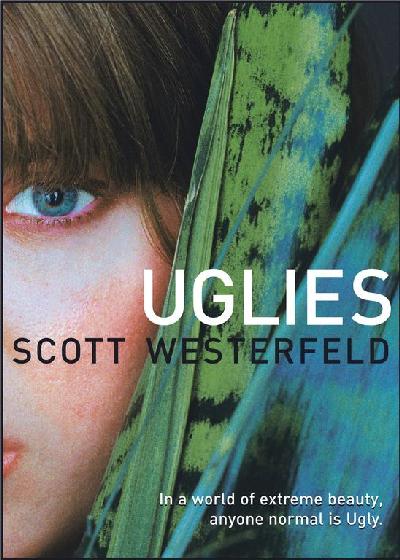
Recently, I read this book called Uglies. I rarely have the time to read non-fiction books, but I finally read this entire novel from start to finish in one day, mainly due to the fact that I was sitting through jury duty and I had nothing else to do. =) But I'm glad that I was forced to read that book that I've been itching to read since I bought it a year ago for it was a really good book.
The story is about a society obsessed with being perfect and how everyone goes through a forced cosmetic operation after their sixteenth birthday to become a pretty. Then they would move to the part of town where the pretties live and play. All they do all day is party and do things that pretty people do. I know this sounds stupid, but it take place in a futuristic society where kids get around town on hoverboards, everything that you can possibly need would pop out of the walls, and authorities keep track of you through an interface ring that you are forced to wear.
While I was reading the part of the story where the main character, Tally, describes what it is like to be in New Pretty Town, I couldn't help but to think about how they lived. What do their homes look like? What does their furniture look like? What kind of art are they into (if they are even into art)? What do their cocktail napkins look like? Or what kind of clothes do they wear?
The imagery that came to mind made me want to start designing things that look futuristic, clean, metallic, sleek, and beautiful. It made me want to create something that they would've used or found aesthetically appealing. Somehow, their society was also environmentally conscious, so whatever I designed, it not only had to be very sleek and modern, but organic at the same time.
Tuesday, October 12, 2010
Week Six Blog Assignment
This is where I work 25% of the time. The city gives me something when I look out the window. Some may call it inspiration?

I got my friend to take my photo while I was 'working'. =D
*Addendum: This is NOT my place. lol. I realized that I forgot to mention this little fact. I was wondering why people kept thinking I live in the city. lol. I always crash here bc I do live in BFE. I do a lot of my work here. Plus, the city inspires me. =)
[Below]
As of recently, this is where I do my work 50% of the time. Normally I work on my desk, but currently it is cluttered with products and boxes bc I just moved. So as of right now, I work on my bed.

For the other 25% of the time, I work in my car or in class. My life is very busy so I try to get homework done anywhere I can.
Wine Bottle Proposal Brief Extended
THEME
When designing this bottle, I figured that I wanted to do something very dramatic. While looking up pictures of grapes, I realized that grape vines have a sense of drama to them. So I went with the idea to use stylized vines as the theme for the design. The bottle with be frosted white with a white transfer of a stylized vine wrapping around the bottle. Also I want to experiment with texture rather than color. The idea of a glossy design on a matte surface of the same color adds the sense of drama that I am looking for without making the design too complicated.
COLORS
My color scheme is going to be primarily black and white. There’s a simple elegance to black and white. I’ve sat at the computer screen for hours trying to pick out a color scheme that may be suitable for the look that I am going for but I always came back to black and white. In my opinion, it makes a whole lot of sense. The type of wine that I am redesigning is a white wine and it doesn’t really offer any obvious hints as to what color scheme is appropriate. The same bottle design can be used to bottle other wines in the same line. If the wine is red, then the logo would reflect it.
FONT CHOICE
I decided to use Times New Roman because it was the only font out of many that seem to go with what I want. The whole company ideal is to get in touch with the classic italian traditions, but I want this bottle to be more modern to stand out from the millions of “traditional” looking bottles on the shelves. I think that Times New Roman was a suitable candidate for adding the sense of history and enabling the design to get in touch with Italy’s past.
HANG TAG
The hang tag provides additional information within a little bifold where the outside is matte black and the interior is gloss white. I’m still debating whether or not if I want the logo on the exterior of the bifold to be white or gloss black. The tag is held onto the neck of the bottle with a black vine-like cable.
THE TOP
To top it off, the cap will have an italian seal on it that is present in the original bottle. The shrink wrap on the top will be matte black with white type going around the neck. I am still debating on whether or not the actual seal should be gloss black, white, or silver.
Sunday, October 10, 2010
wine bottles are dramatic
This is where I am heading towards with my wine bottle.
I got inspired by grape vines and wanted to do something really dramatic. So I want to use stylized vines as the theme for the design. The bottle with be frosted white with a white transfer of a stylized vine wrapping around the bottle. The texts are all black. I went with Times New Roman because it was the only font out of many that seem to go with what I want. I want a some sense of classical traditions with the new modern design of the bottle. The text is black for this bottle design, but I was thinking that the logo can change colors according to what wine is being sold within the bottle. The hang tag provides additional information within a little bifold where the outside is matte black and the interior is gloss white. I'm still debating whether or not if I want the logo on the exterior of the bifold to be white or gloss black. I want to play around with texture, in this case, it's glossy designs on matte paper. The tag is held onto the neck of the bottle with a black vine-like cable. To top it off, the cap will have an italian seal thing on it that is present in the original bottle.

I got inspired by grape vines and wanted to do something really dramatic. So I want to use stylized vines as the theme for the design. The bottle with be frosted white with a white transfer of a stylized vine wrapping around the bottle. The texts are all black. I went with Times New Roman because it was the only font out of many that seem to go with what I want. I want a some sense of classical traditions with the new modern design of the bottle. The text is black for this bottle design, but I was thinking that the logo can change colors according to what wine is being sold within the bottle. The hang tag provides additional information within a little bifold where the outside is matte black and the interior is gloss white. I'm still debating whether or not if I want the logo on the exterior of the bifold to be white or gloss black. I want to play around with texture, in this case, it's glossy designs on matte paper. The tag is held onto the neck of the bottle with a black vine-like cable. To top it off, the cap will have an italian seal thing on it that is present in the original bottle.

Thursday, October 7, 2010

Tuesday, October 5, 2010
Real Bottles Have Curves...
so, here i am sitting in typography class thinking about my wine bottle. Then I came across a page that lists the different types of wine bottles. I think it'll be helpful for me in picking and searching for a specific bottle shape.
Click here for an indepth explaination on the types of bottles.
Subscribe to:
Posts (Atom)